Aadil
A free-range chicken brand built on appetite, warmth and a Nigerian sense of humour, from a hand-drawn script to a truck driving through Kaduna.
A brand thatbehaves likea person.
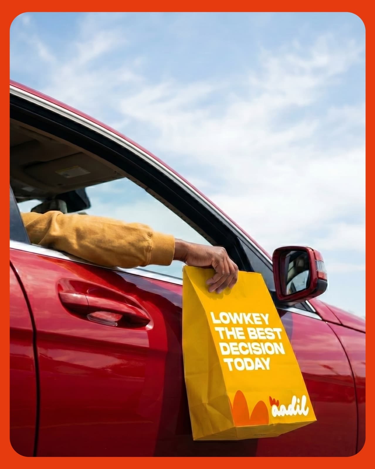
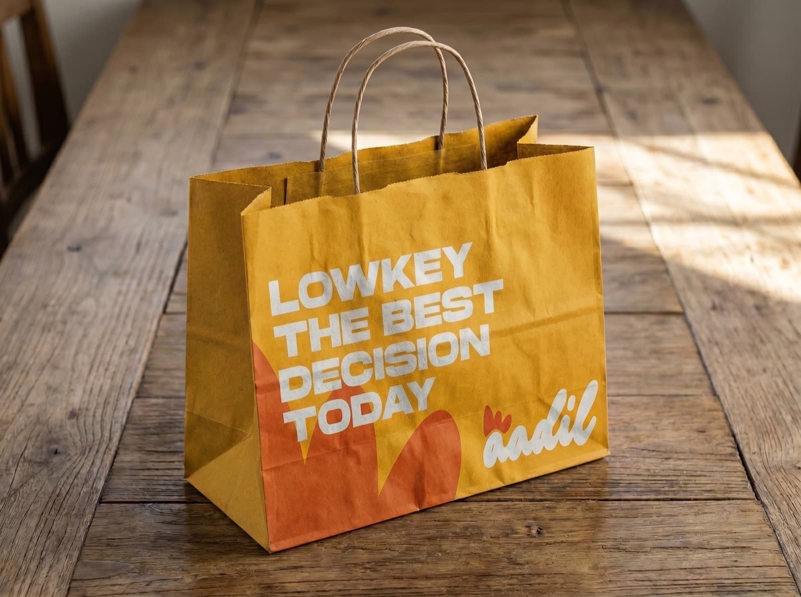
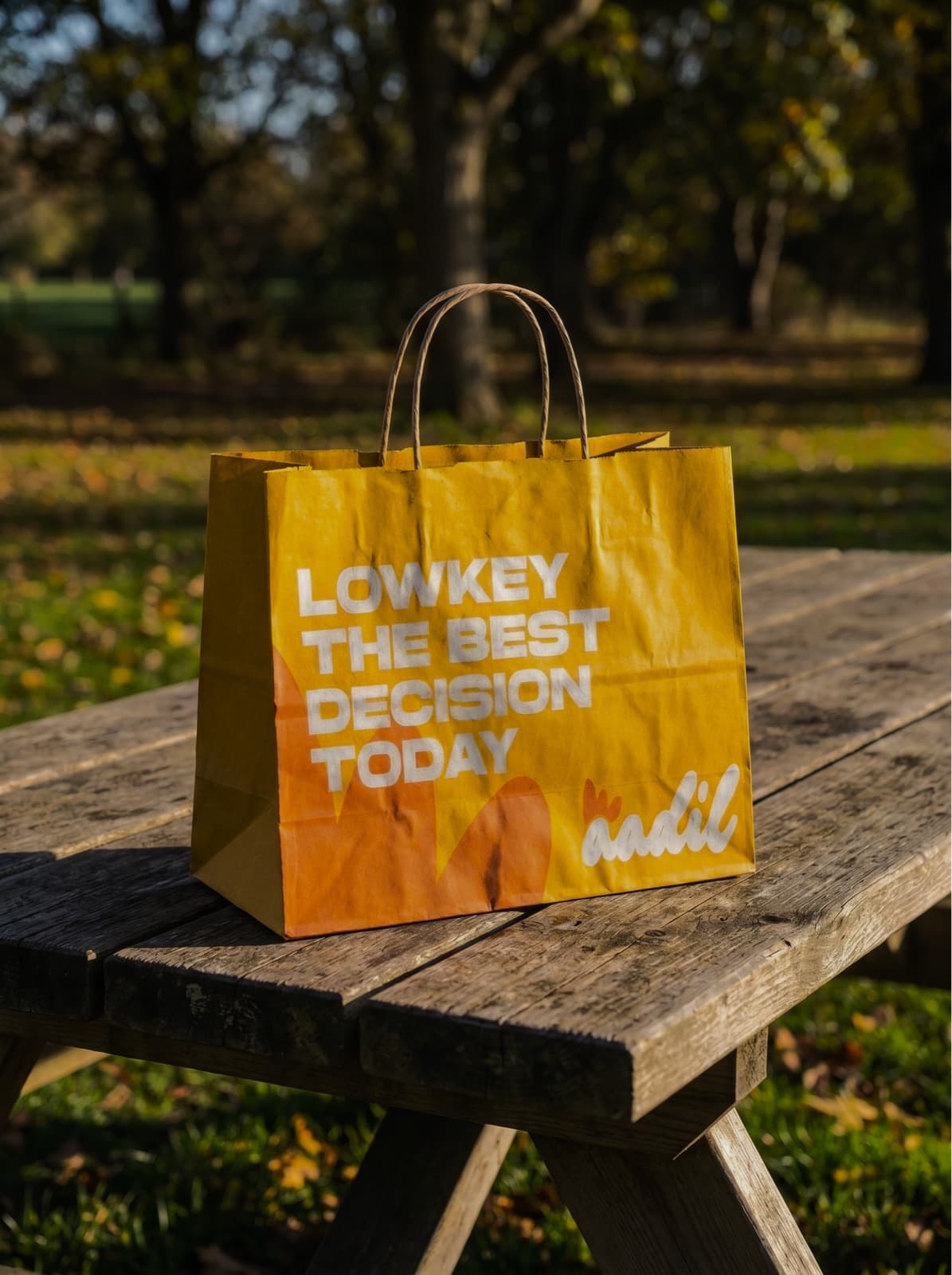
Aadil sells chicken. That is a category where everyone shouts about price and nobody sounds like a human being. The opening decision was to make the brand talk the way people actually talk about food, “lowkey the best decision today”, and let the warmth do the selling.
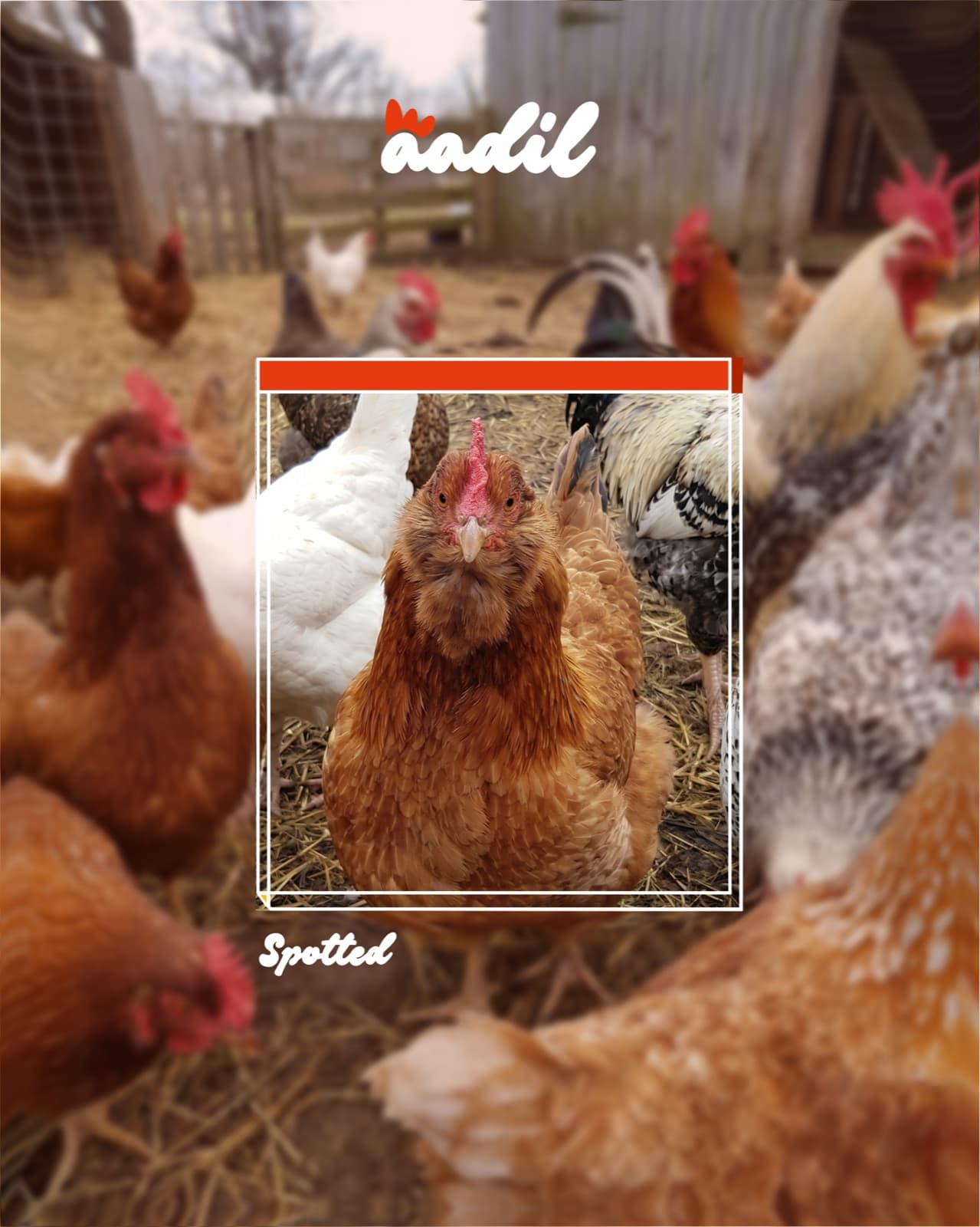
A soft white script with a red comb sitting on top of it, a yolk-yellow field, and photography of birds that are visibly alive and outdoors. Nothing about it apologises for being a chicken brand.
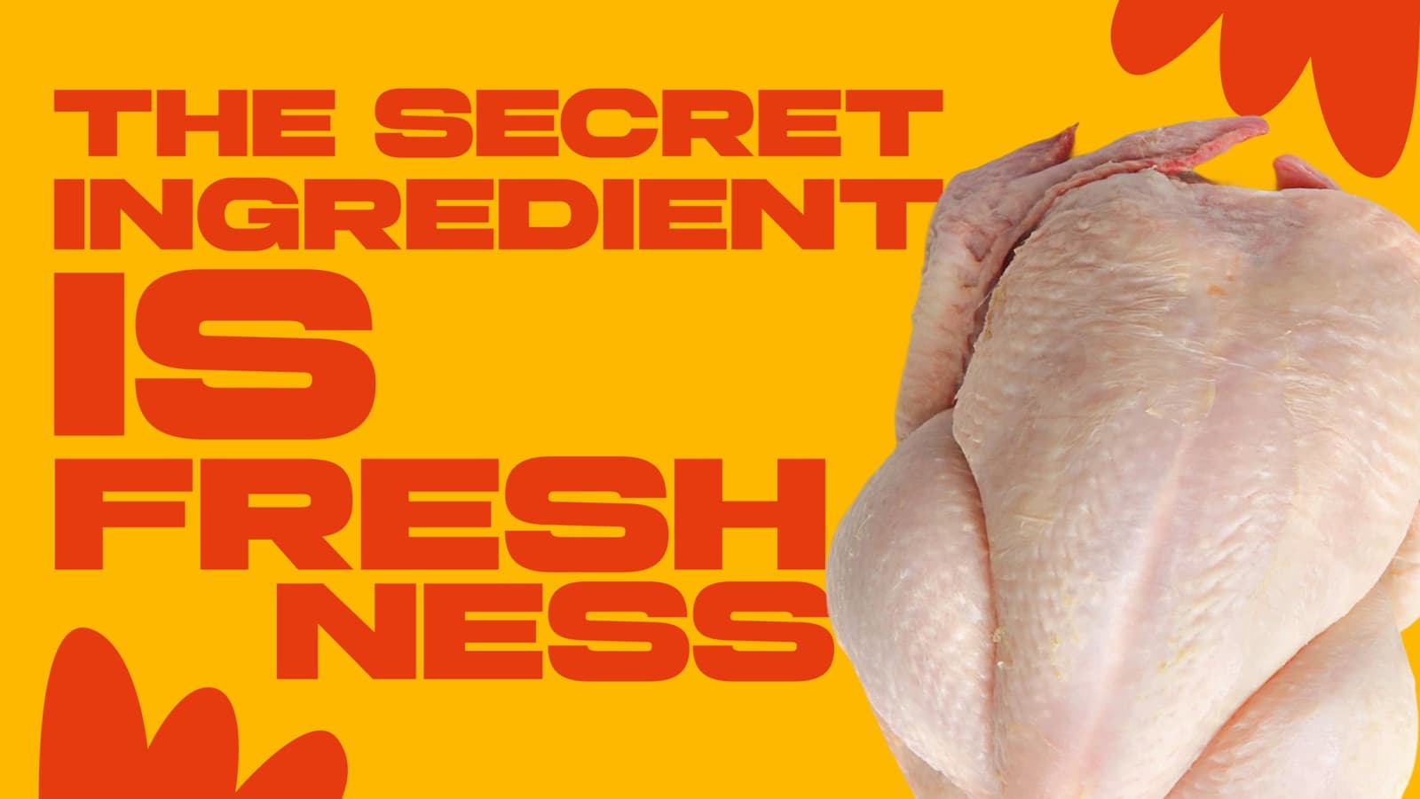
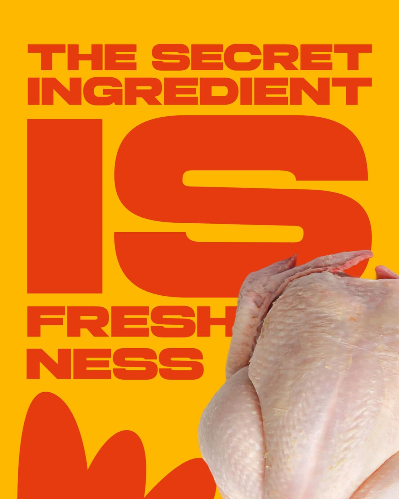
The secret ingredient is freshness, so the identity had to look fresh before it said anything.
The copyis the layout.
Aadil’s headlines are not set inside a layout. They are the layout. Gilroy at its heaviest, cropped tight to the frame, red on yolk yellow, with the bird pushing in from the edge. There is no decoration doing any work.
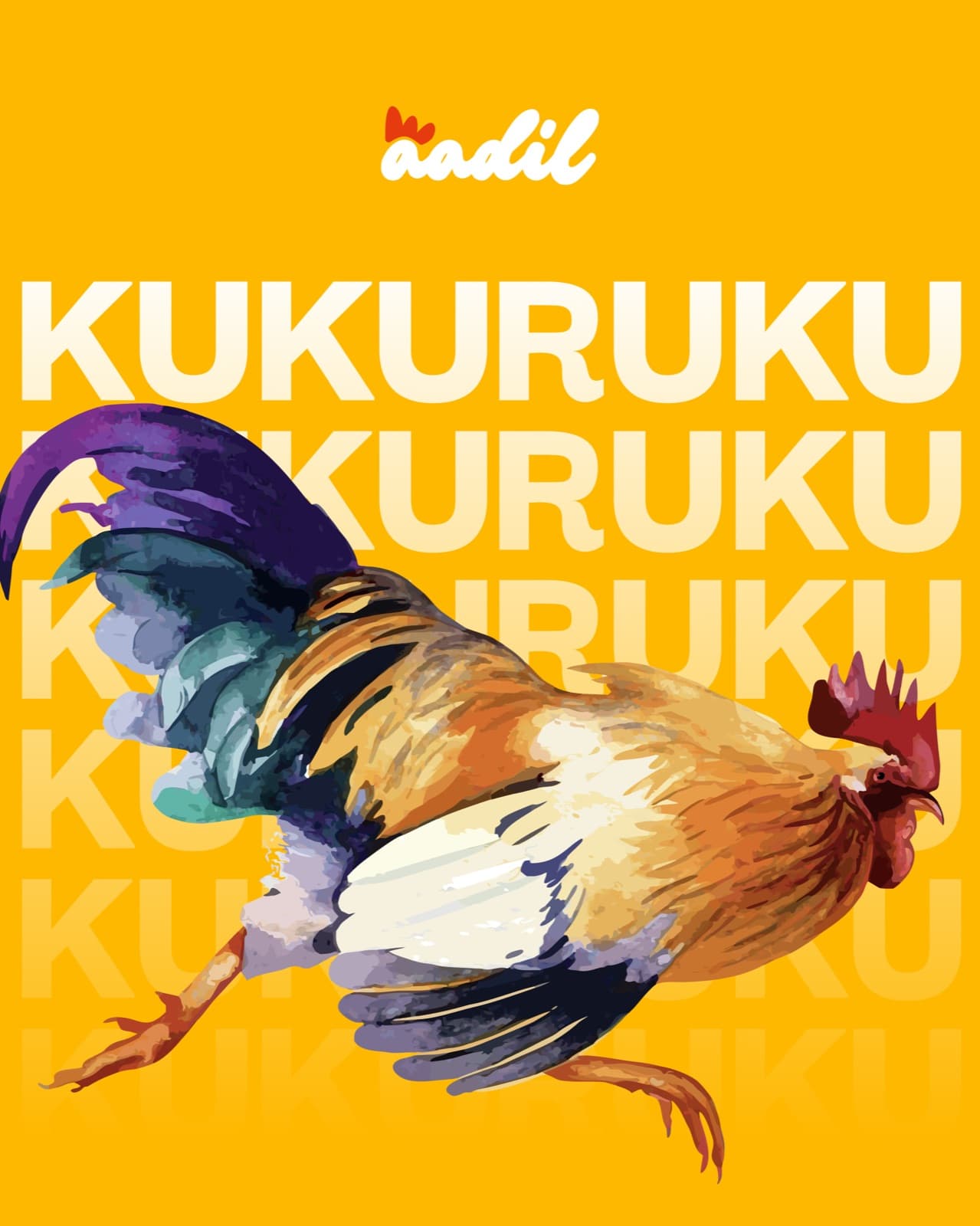
The vocabulary is deliberately Nigerian and deliberately spoken. KUKURUKU is not a slogan, it is the sound a rooster makes. That single decision does more brand-building than a paragraph of positioning ever would.
The truckis the billboard.
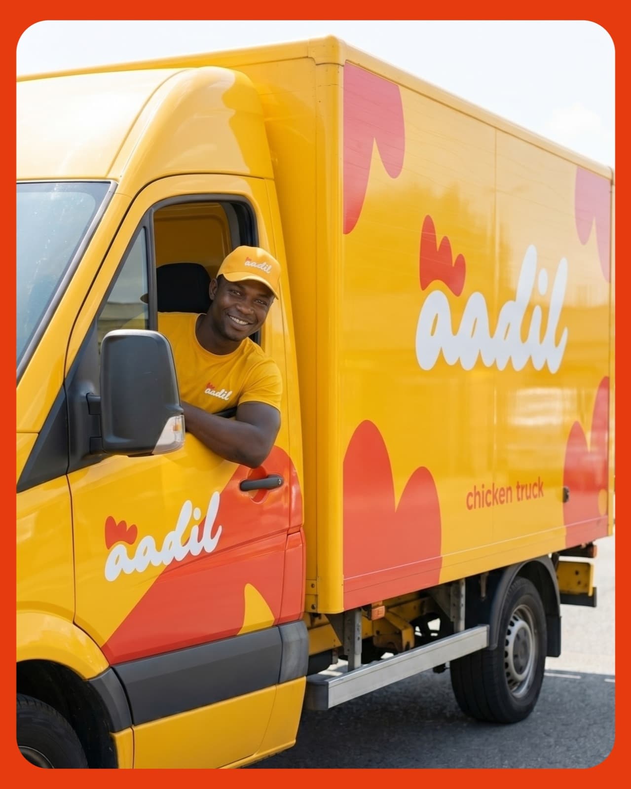
A delivery fleet in a Nigerian city is seen by more people in a week than any campaign will reach in a month. So the truck was treated as the primary application, not an afterthought: full yolk-yellow body, the script running the length of the box, comb shapes cropping off the panels.
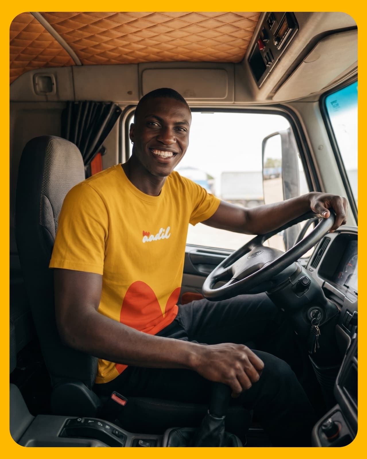
Uniform followed the same logic. A driver in a branded tee and cap is a brand asset who talks back, remembers your street, and gets photographed.
Chicken truck. Two words on the side of a van, doing more work than a strapline.
The palette.
Two colours do almost all the work: a yellow warm enough to read as edible, and a red reserved for the comb, the accent and the shout. Everything else is support. Click any swatch to copy its value.
Look closer.
Click any image to open it full size.
Next project
Enlira