Enlira
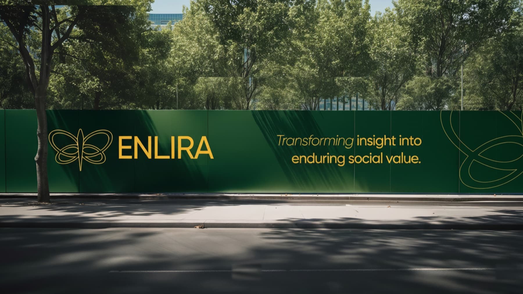
An identity for a firm that puts institutional discipline behind social outcomes: forest green, gold, and a butterfly drawn in one unbroken line.
Impact deservesthe same disciplineas any investment.
Impact investing has a presentation problem. It is usually dressed either as charity (soft, apologetic, watercoloured) or as finance, in which case the impact disappears entirely. Enlira needed to look like neither.
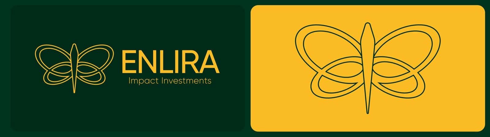
The answer was a forest green as serious as any institution, a gold that carries the optimism, and a single continuous line drawing of a butterfly: transformation stated once, without a metaphor being laboured.
Great impact is never built alone.
A system is only realonce someone elsecan run it.
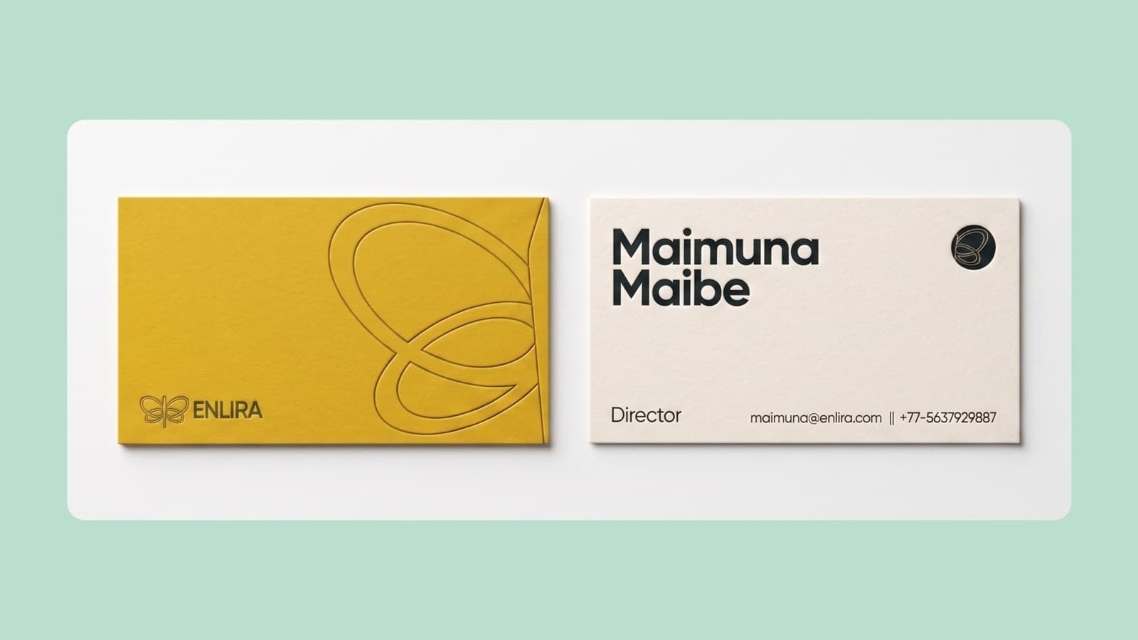
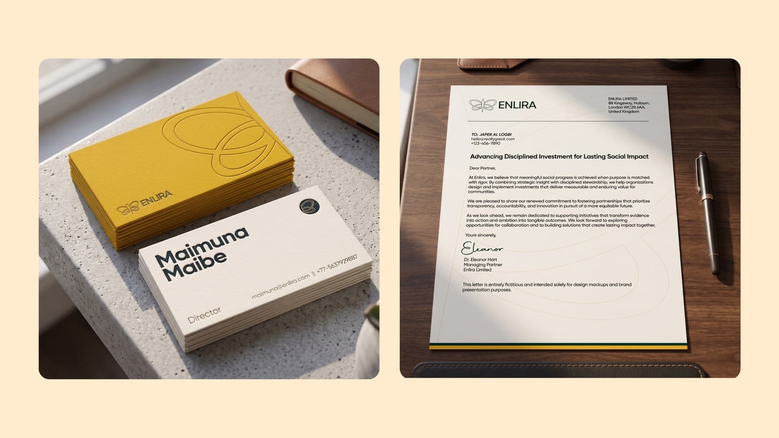
An identity that only works when its designer is in the room is not an identity, it is a decoration. Enlira’s system was built so an internal team could extend it on a Monday morning without asking permission.
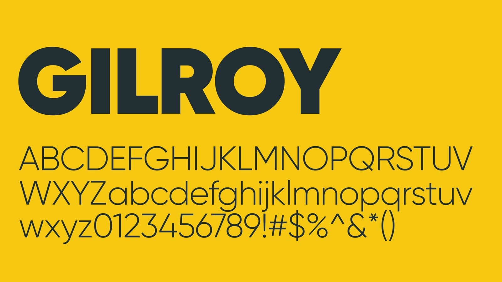
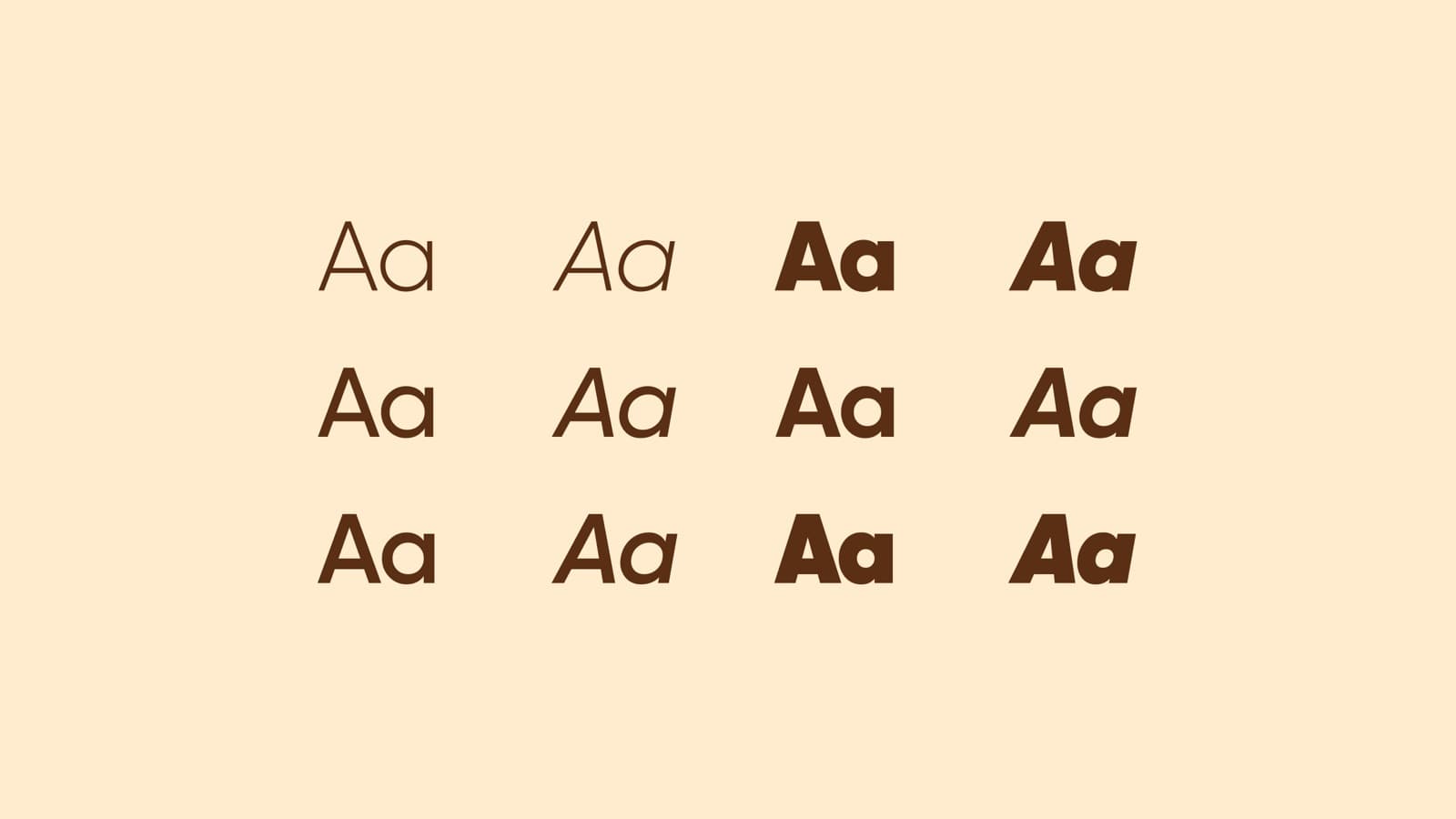
One mark with two lockups. Seven colours with defined roles. One typeface across every weight. The constraint is the point. There is very little room to get it wrong.
Impact investment,said out loud.
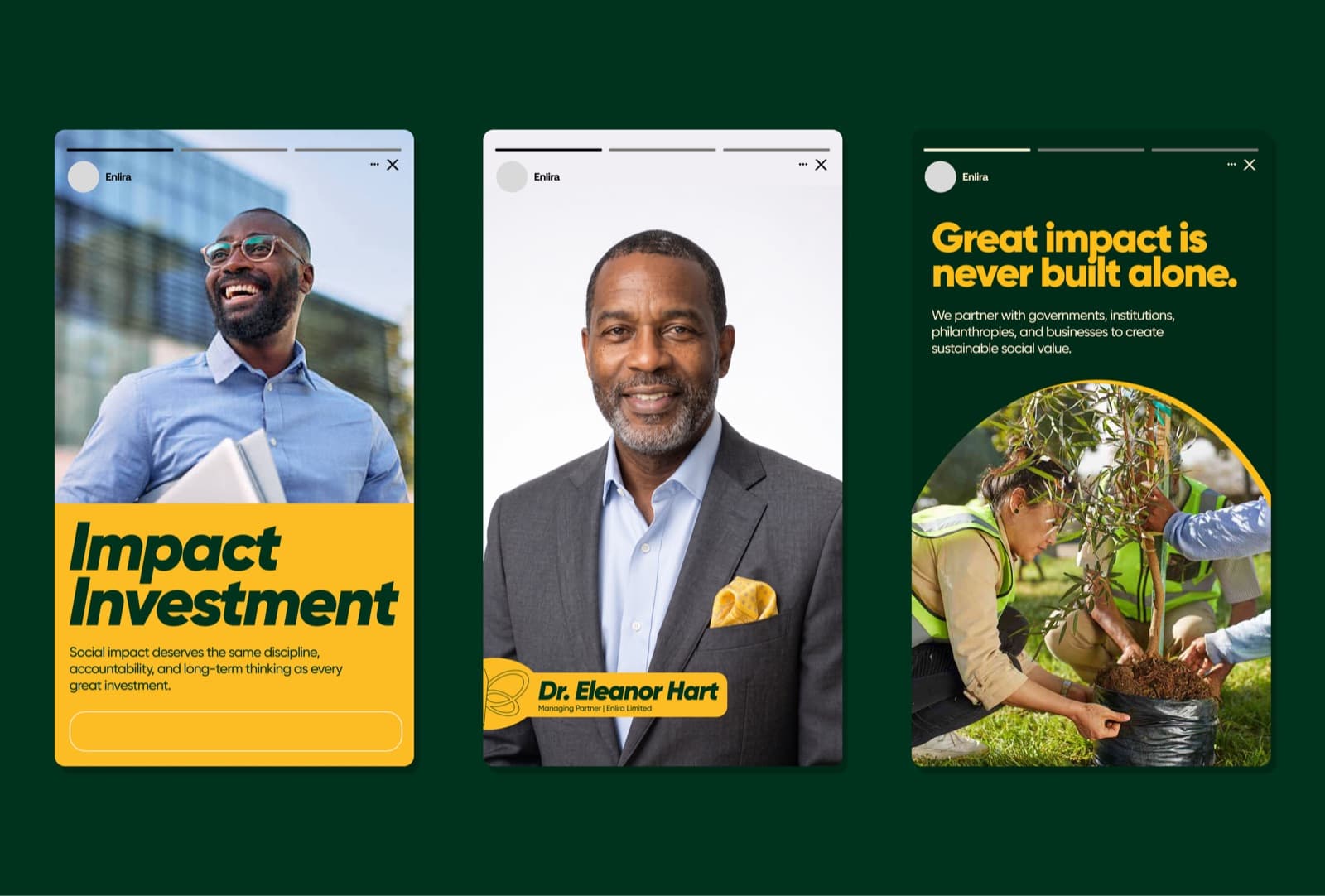
A campaign for an impact firm has to do two contradictory things at once: sound credible to institutional capital, and mean something to the people the capital is meant to reach. Splitting the difference produces something that convinces nobody.
So the campaign leads with the sentence and lets the photography carry the proof: people planting, people working, people who are visibly not stock footage.
The palette.
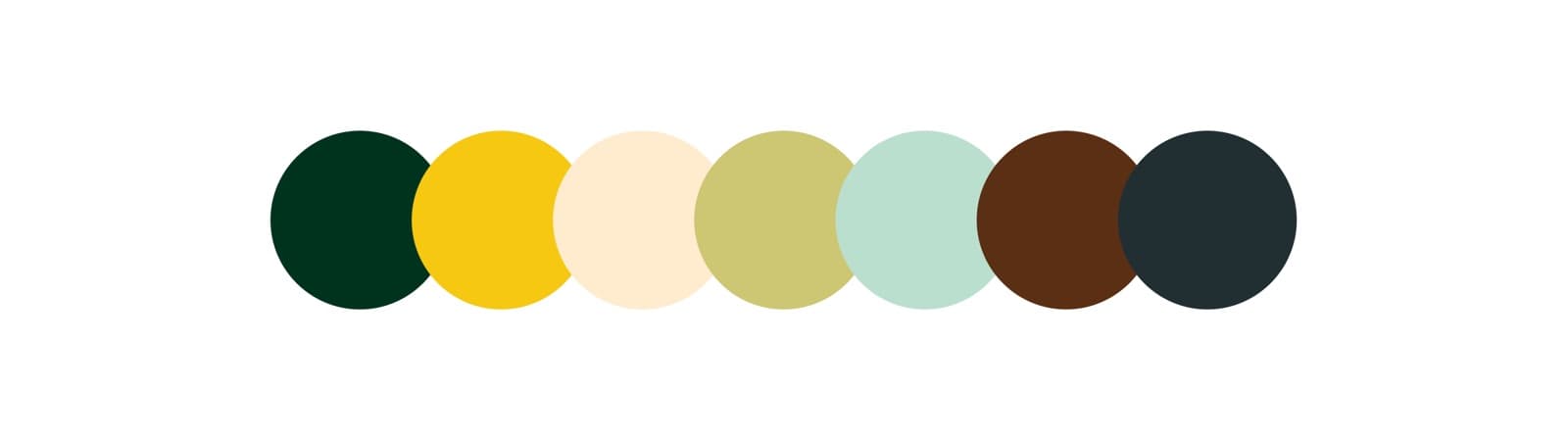
Seven colours with defined roles. Forest and gold carry the brand; the remaining five support without ever competing for the headline. Click any swatch to copy its value.
Look closer.
Click any image to open it full size.
Next project
Gidan Kasa