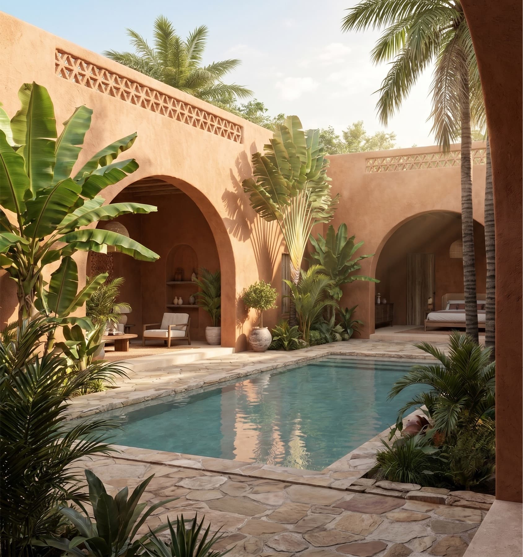
GidanKasa
Hausa for “mud house.” A hospitality concept where the ground the building stands on became the material, the palette and the name.
Not a buildingwith a logoattached.
Most hospitality projects are assembled in sequence: an architect draws the shell, an interior designer dresses it, and a brand studio arrives at the end to name it and print the menus. Each step inherits decisions it had no part in making.
Gidan Kasa was approached the other way round. The name, the plan, the plaster, the light and the language were treated as one system, resolved together. The result is a place where you cannot separate the branding from the architecture, because there was never a moment when they were separate.
A space can influence behaviour. So it should be designed with the same intent as an identity.
Gidan Kasa,mud house.
The name is Hausa, and it is literal. Gida is house. Kasa is the ground, the earth, the land itself. Naming the place after its own material means the brand can never drift away from the building. It is a promise the walls keep on their own.
The mark is written, not typeset. A single continuous line, drawn with the same looseness as a finger dragged through wet plaster, so the logotype reads as a gesture belonging to the surface rather than a label applied on top of it.
Touch isthe argument.
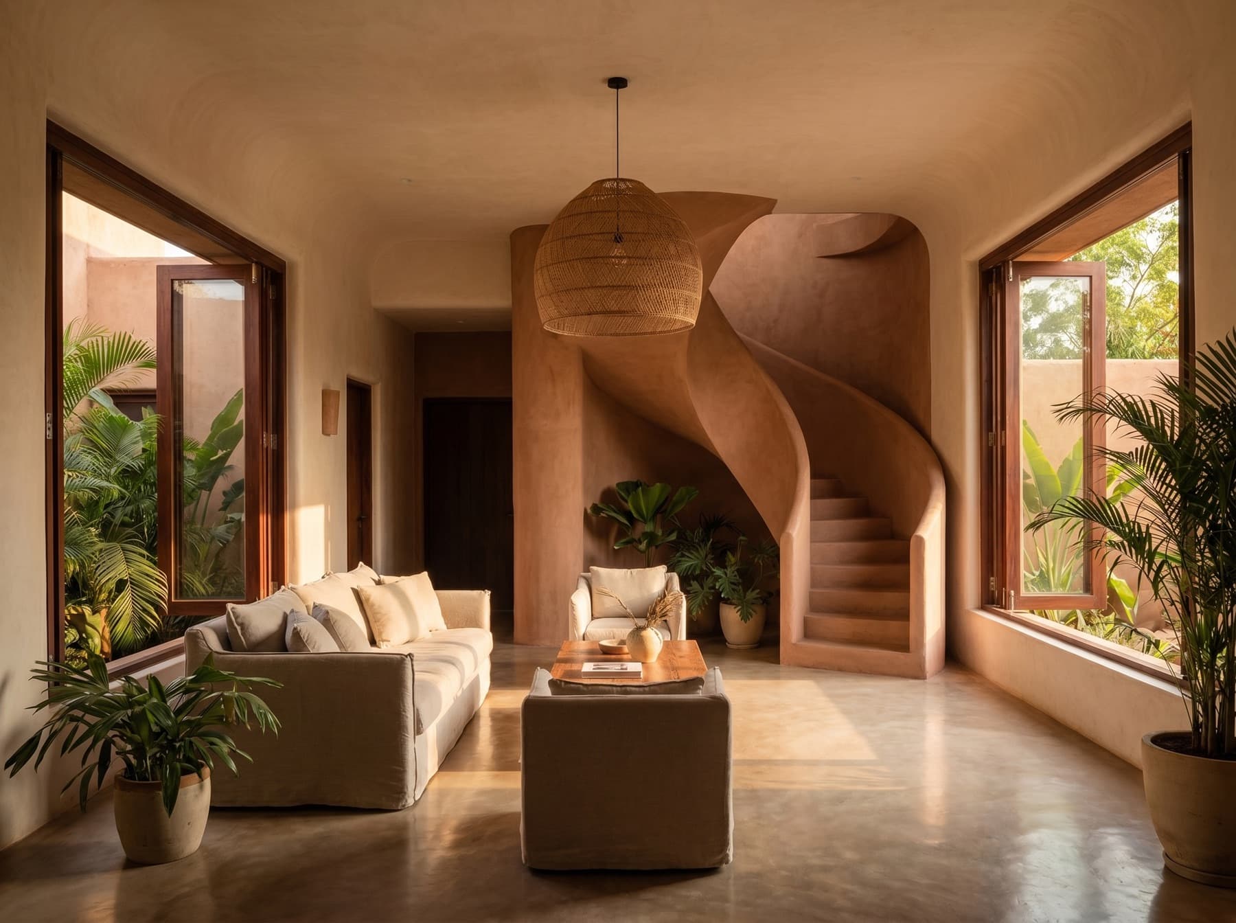
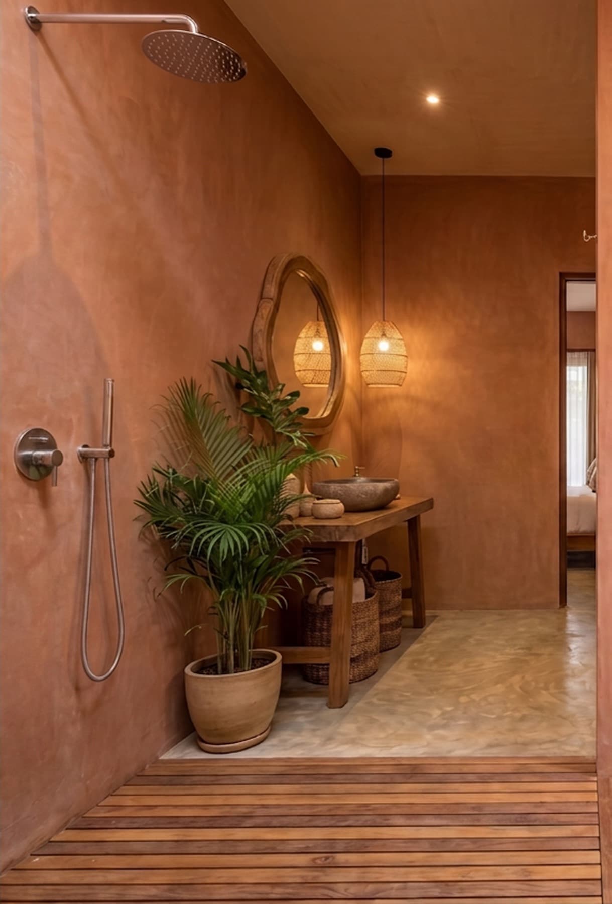
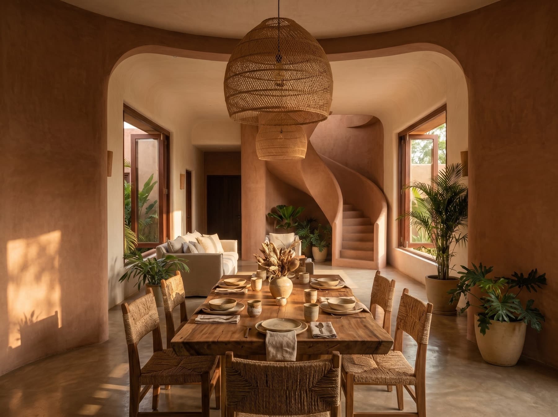
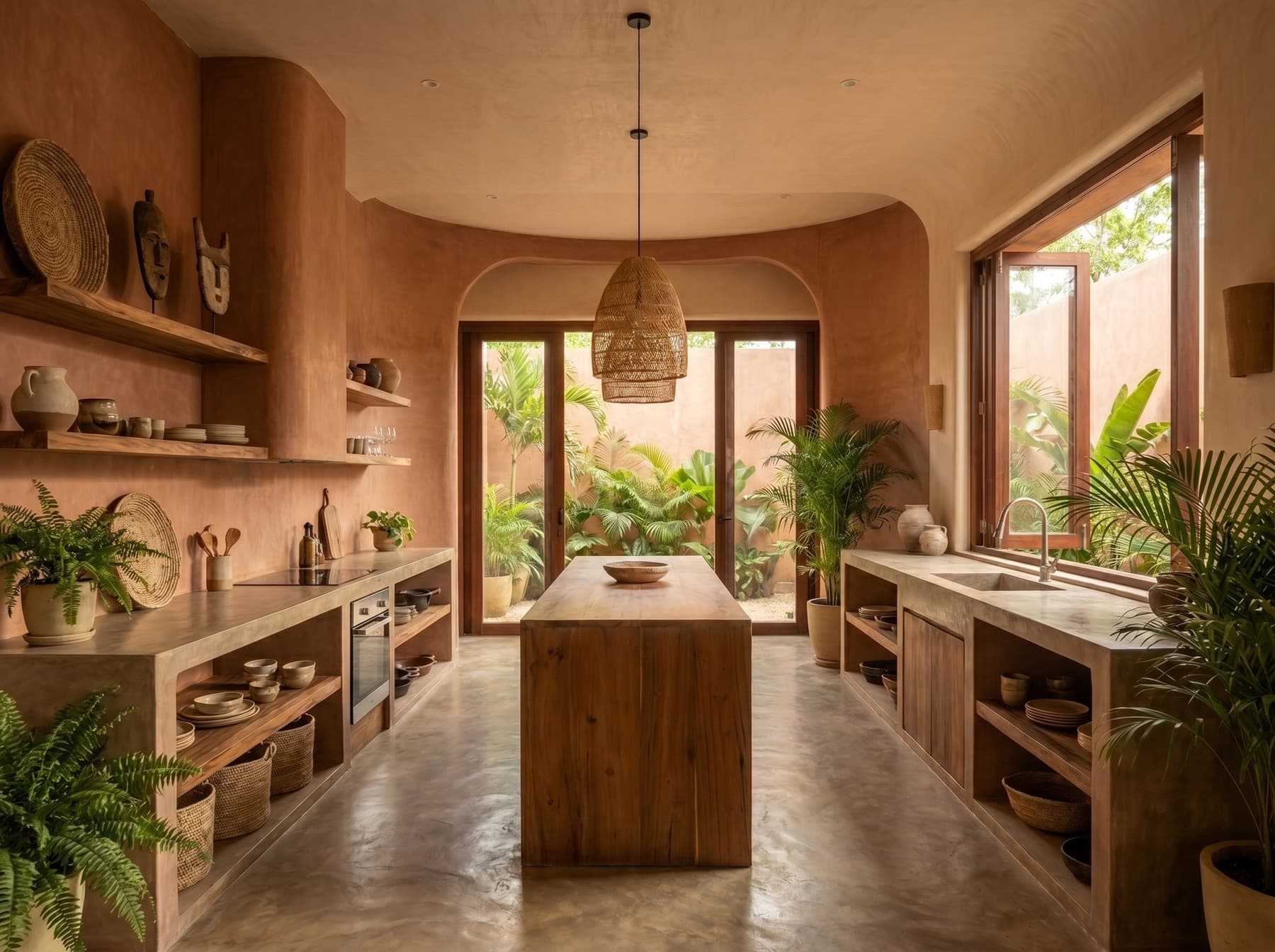
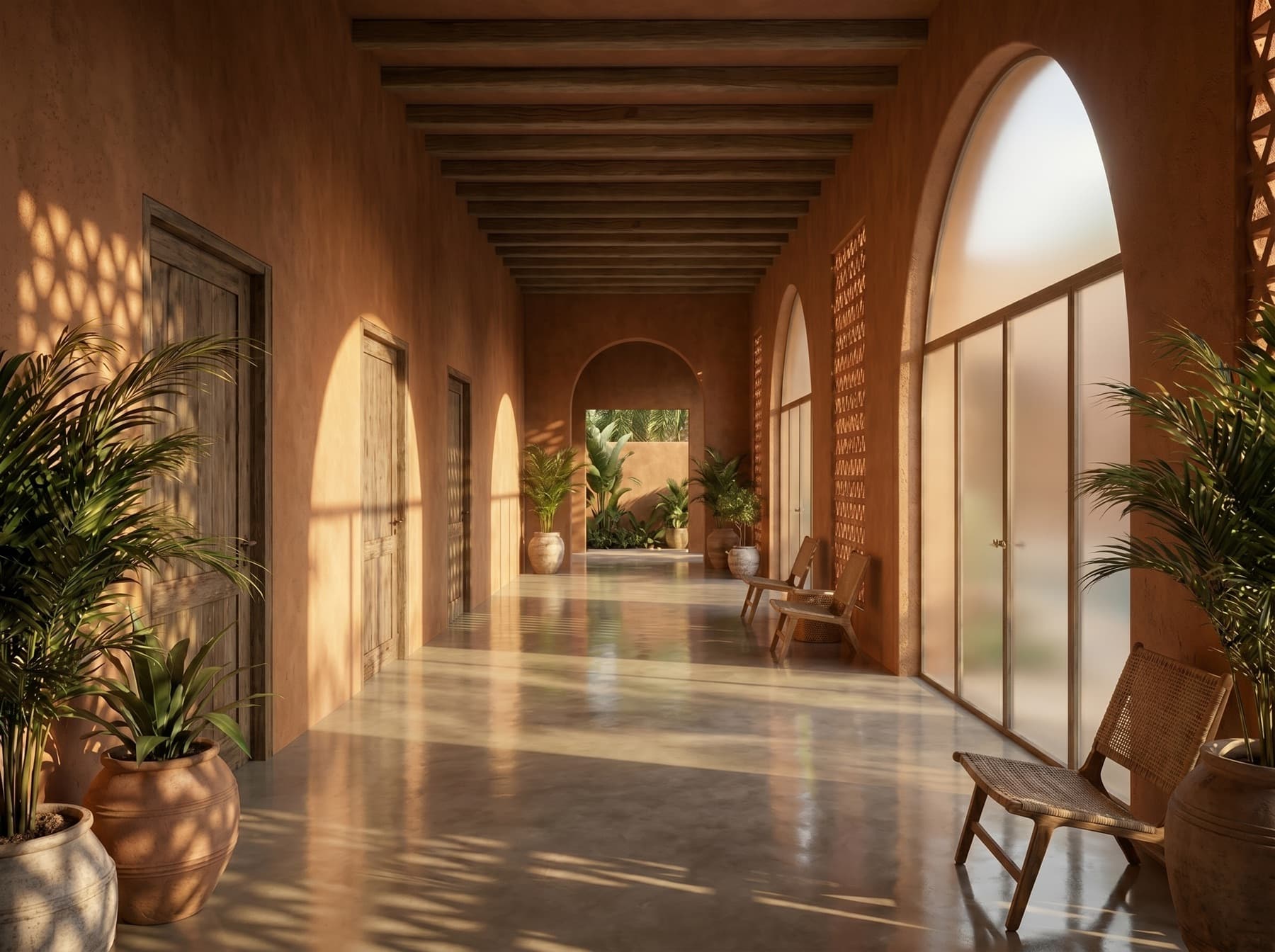
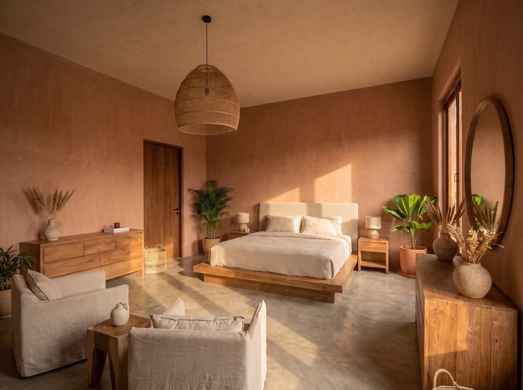
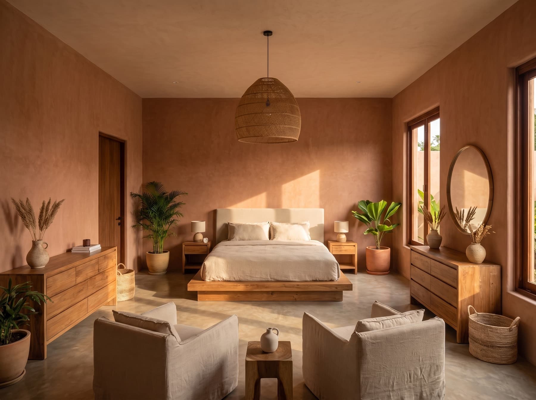
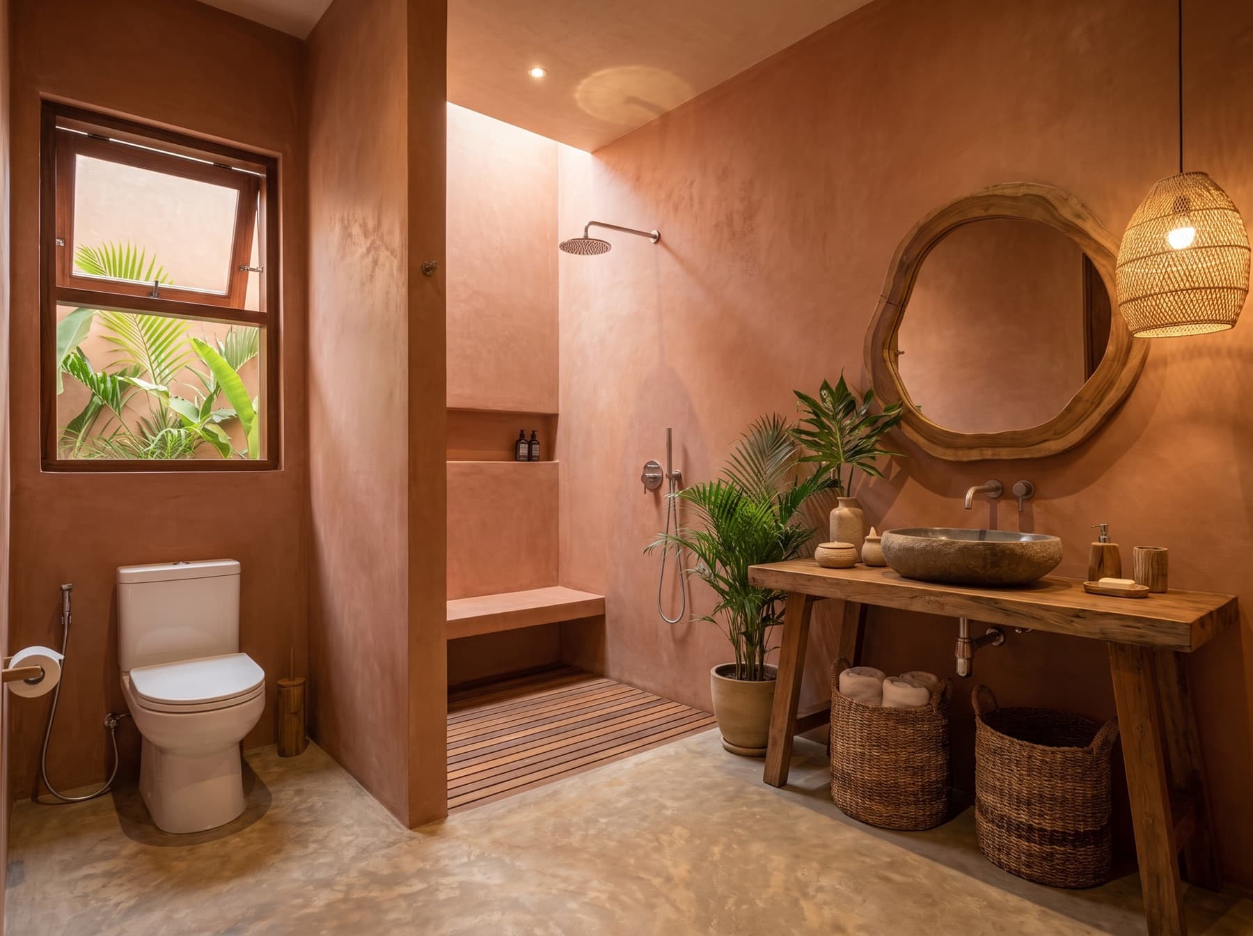
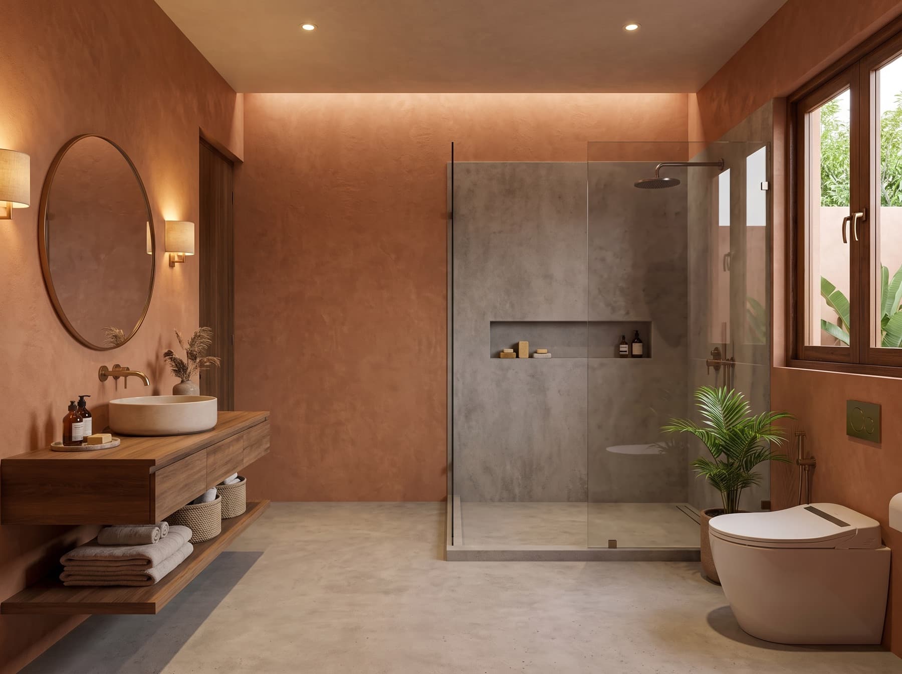
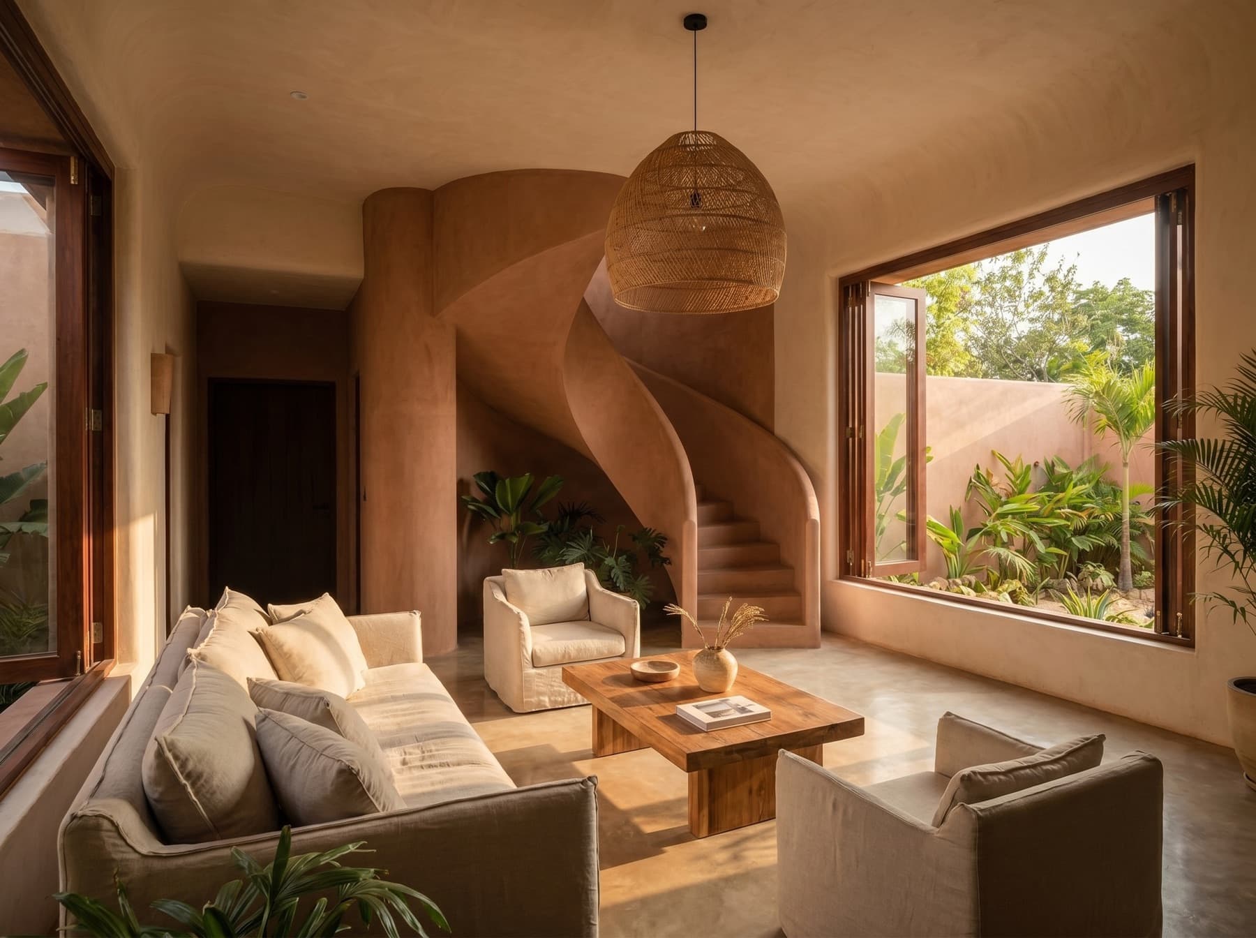
Earth render, cane, oak and raw linen were selected for how they behave over time rather than how they photograph on day one. Clay absorbs heat and gives it back slowly after dark. Cane filters light into pattern. Linen creases and stays creased.
Each one is a material that improves by being used, which is exactly what you want from a place people are meant to live in, briefly.
The courtyarddoes the organising.
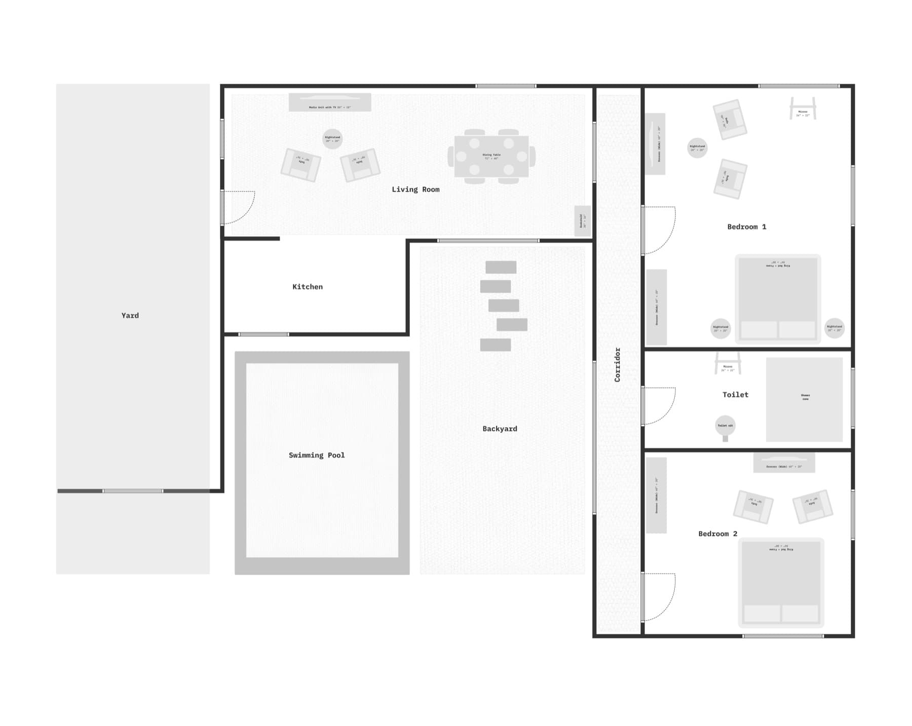
Two bedrooms, a living room, a kitchen and a pool, arranged so that no room reaches another without passing through open air. The corridor is deliberately exterior. You feel the temperature change on the way to bed. It is a small inconvenience that does more for the experience of the place than any amenity could.
One system,many surfaces.
Gidan Kasa is the clearest argument I have for the way I work. The name explains the material. The material sets the palette. The palette decides the light. The light shapes the plan. Nothing here was applied at the end.
This is what I mean by designing systems rather than deliverables, and it is why I don’t separate branding from architecture, or photography from spatial thinking. They are different surfaces of a single decision.
I don’t believe great design lives in one category. I believe it lives in the connections between them.
Drag to compare the drawing with the render
The palette.
Nothing in the palette was chosen from a swatch book. Every value was sampled from something present on site: the clay of the render, the shade under a mango tree, the bleached sand of the courtyard floor at midday, the bark of the doors. Click any swatch to copy its value.
Look closer.
Click any image to open it full size.
Modelled beforeit was drawn.
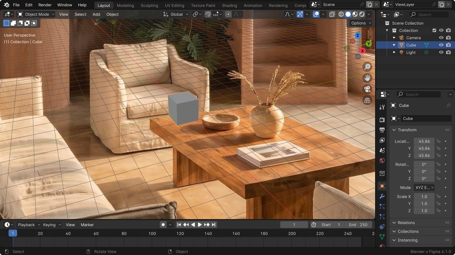
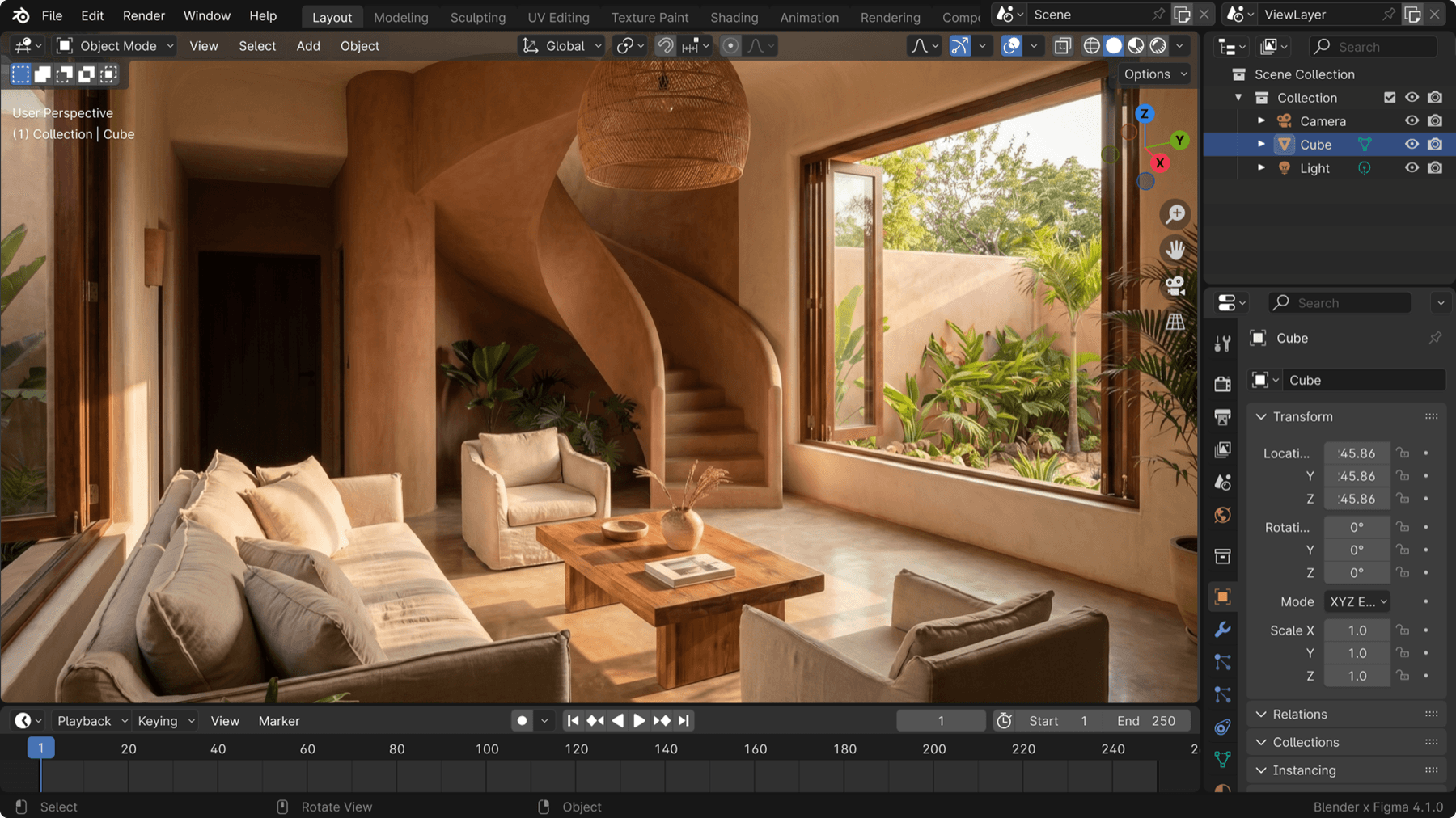
The whole scheme was resolved in 3D first. Working in the model rather than in elevation meant light could be tested directly. The sun was moved until the stair threw the right shadow, then the plan settled around what had been found.

Next project
Aadil